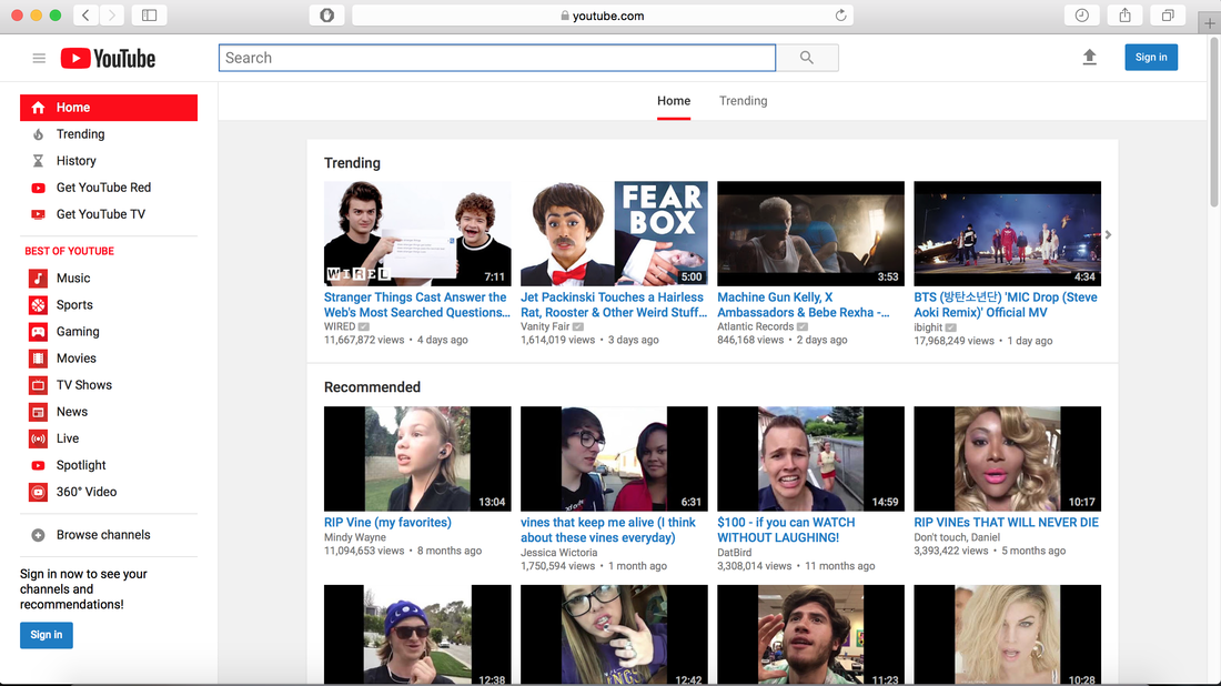
  Recently I’ve been learning about the Q3 principles of design in class, and when looking for a professional website to critique Youtube.com immediately came to mind. In the screenshot above, many principles are being used correctly and incorrectly. The first principle I thought of was Hick’s Law, because of how many options are presented on YouTube at any given time. Hick’s Law explains that the amount of time it takes to make a decision increases as the number of alternatives increases. The viewer has so many options to choose from right away with videos going on endlessly on the page. The amount of time it takes to look at the options and pick the video best suited to watch would take forever. That’s why YouTube implemented a second design principle of nudging in order to get viewers to click faster. Nudging is a way to alter behavior without restricting options or significantly changing incentives. YouTube/YouTube Creators now have to use nudging such as clickbait in order to keep up with competition. The different categories on the left are type of nudging called a structured choice in order to simplify the process. Every video on the page is trying to nudge the viewer into watching their video. The third principle I saw was Signal to Noise ratio which is the ratio of relevant to irrelevant information showed in a display. There is almost no irrelevant information on the webpage, everything has a place and purpose. Therefore, the noise is very low and the message of the site is crystal clear. The fourth principle seen is the red effect which is the tendency to see women/men/objects with the color red as attention-grabbing or attractive. On YouTube the use of Red is everywhere, highlighting all the categories , almost nudging the viewer to click on them. It is also prevalent in the logo which makes you remember it. The last principle I saw was consistency because of the layout of the page. Consistency means that the usability is improved when similar parts are expressed in similar ways. You tube’s aesthetic consistency is exceptional with every page on its site is identical, even across all platforms. Overall, YouTube uses these principles of design fairly well which is part of the reason why it is the most popular video streaming site around.
0 Comments
 Over the past couple of weeks, I have been learning about some new design principles in class. I ran across this anti-tobacco advertisement online and I noticed that it applies several principles of design in order to persuade its demographic. One of the first principles I immediately noticed was the use of highlighting to draw my eye to the focus of the poster. Highlighting, of course, is a way to draw attention to text or images visually through the use of color, fonts, font size, italics, etc. In this anti-smoking ad, the bright red word BURN in all caps grabs the attention almost instantly because it is so different from the shades of color from the rest of the poster. In fact it is very similar to the von Restorff effect because the red font is more unique than the rest. The font size is also bigger in order to get the message of that portion of the text across easier. The use of color here is also clever because the red and yellow color scheme of the text matches the colors of the cigarette burning. The second principle that came to mind when looking at this ad is the signal to noise ratio shown. Signal to Noise Ratio is the amount of relevant information to irrelevant information shown visually in design. So the more unnecessary components shown, the harder it will be to for the viewer to focus and understand the relevant information. For this ad the ratio is pretty high due to the simplicity of its design. Most of the components are efficient and do not take away from the message by adding unnecessary noise. However, one nitpick would have to be that the smoke effect could be distracting and should be lessened. The final principle I noticed was the exposure effect that takes place with most anti-smoking ads. The exposure effect occurs when people are “exposed” to the same stimulus over and over again, therefore that stimulus becomes accepted and liked. The only problem is that in order for the exposure effect to work it cannot be a stimulus that has a negative connotation. This is an interesting concept because children who have grown up with anti-smoking ads have a neutral opinion about cigarettes and that is when they grow up they will likely not smoke cigarettes. On the other hand, adults who already smoke have a negative opinion about cigarette ads and that is why most fail to persuade. In fact this poster does the opposite of what the exposure effect is intended to do, it makes people want to smoke more just to prove the poster wrong. Anyway, I thought it was an interesting design that utilized many principles I’ve come to learn.
|
AuthorJames Caspary Archives
January 2019
Categories |
 RSS Feed
